We have just updated the websites for The Key for School Leaders and The Key for School Governors, with the aim of making them clearer, cleaner and more user friendly.
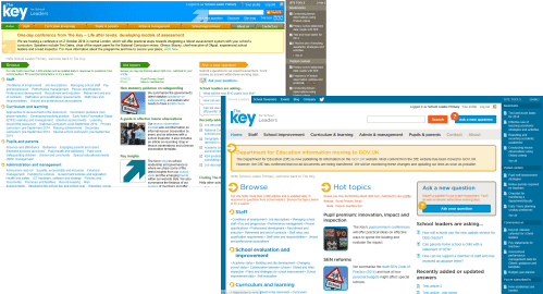
[caption id="attachment_1669" align="aligncenter" width="499"] The homepage for our school leader service, before and after the changes[/caption]
Responsive, mobile-friendly design
One of the most important changes we have made is to introduce responsive design. This means the site layout responds to the size of the screen – from a smart phone to a large widescreen monitor. We know that our members are often on the move – school leaders are rarely at their desks, and many governors juggle their role with other responsibilities. We hope these more ‘mobile’ members will now have a much better experience. We've also increased the size of text on the page. Since the websites were first designed, monitor sizes and screen resolutions have increased, so text appears smaller. We wanted the redesigned site to be easy to read from a natural viewing distance on all devices.
Some other changes worth highlighting: We've made the ‘Ask a new question’ button more prominent, to make sure our members know that if they can't find what they're looking for, we can look into their question.
The ‘Downloads’ and ‘See also’ sections of our articles are also more prominent now, to highlight the range of material available to our members, including KeyDocs.
And we have added a navigation bar at the top of the page, so members can move between our websites and services, and view our Twitter feed.
Design principles
I asked Francois Jordaan, Director of User Experience at Isotoma – our website development partner – about the principles behind the design, and the highlights of the project. He said:
Generally, when redesigning a site, I try to stick to the principle of not changing something unless it's solving a problem, or a clear improvement. I am not a fan of change for change's sake, or attempting to impress other designers. I want users to be able to get on with things as normal, right from the outset. I was thrilled to make improvements to the reading and browsing experience, which I hope will immediately benefit users.
I also wanted to retain the bold use of colour from the previous design. This is not only to be pleasing to the eye – colours are really helpful in guiding the eye around the page, making the different sections more distinct, and helping the most important elements stand out.
Finally, I removed some elements that were making pages look a bit cluttered. If you don't notice anything missing, then I've removed the right things.
Ideally, users won't notice the design, beyond being able to find and read the information they need easily, using any device, with a little less eye-strain.
What do you think?
We hope you'll enjoy using the redesigned websites, and that you'll share any feedback with us. We're always keen to hear members' thoughts on our websites, as we continue to develop the way we serve you.